


Nowadays people have shorter attention spans. People are easily distracted when reading on smart devices. I want to find experiment with methods to encourage people to read books. There are many categories for books, therefore I decided to focus on art and literature.
I created an interactive website that can make the portrait talk to the user about the story behind the painting. Reading book can be boring to some people, but having the character from the book talking makes the experience more interesting.
I did some interviews about reading books. Interviewers pointed about reading books can be boring sometimes. One of the interviewer have dyslexia. We talked about how dyslexia makes reading more difficult. I decided to create a platform for both dyslexic and non-dyslexic readers.
I created personas based on the interview.

I was not familiar with the dyslexia, therefore I did some research in this field. I discovered some fonts can help dyslexic reader having better reading experience. Dyslexie Font is a font that is designed for dyslexic readers. Each alphabets have different shapes and unique design. In this way, dyslexic user won’t mix up the alphabets while they read.

Then, I read the book “Dyslexia in the Digital Age: Making IT Work”. In this book, the author shows a graph of the preference fonts between dyslexic readers and non dyslexic readers. Surprisingly, Comic Sans was the most preferred typeface for dyslexic readers. Furthermore, the research shows that in Hungary, 50% of dyslexic readers and 75% of non-dyslexic readers preferred the font Times.

In the research Dyslexia: the Role of Vision and Visual Attention shows the “yellow or blue filters, can greatly increase reading progress in children with visual reading problems.” I also asked my friend who have dyslexia, and he told me the research is true. He have a blue ruler to assist him read physical books. Adding a blue filter makes him a lot easier to read.
In this research, the paper shows the difference of the eye movements between dyslexic and non-dyslexic readers. The number and duration of fixations for dyslexic readers are a lot different than non-dyslexic readers. Dyslexic readers have higher number of rightward fixations. Which also means they might take more time to read.

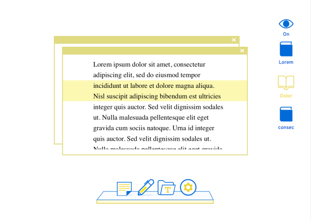
I designed an interface based on the idea of desktop UI. I added a yellow ruler on the text to help dyslexic readers to read. According to the research, having a yellow filter on the text can make dyslexic reader easier to read. When the user scroll down the page, the yellow ruler will follow your mouse and highlight the line that you’re reading. This way, the dyslexic reader will be less likely to forget where they’re reading.
I also deigned another interface. When scrolling the text, it will blur the top and bottom, only focus the middle section. However during the user test the right one works better.

Result: Most of the researchers I've done were mainly focusing on dyslexia. However, I wanted created a platform for both dyslexic and non-dyslexic readers. After the discussion with the supervisor, I was suggested to create an experimental website.
I came up with an idea that combined paintings and books. In the past, I've read some books that are inspired by the painting.I wanted to make a website that shows people the relationship between art and literature. The painting can talk about the book, makes the user feel more engaging.
I created the userflow for the project.


I designed a few layouts in Figma and editing the videos in Premier. I used the software Crazytalk to create the talking animation. After prototyping the design, I coded it.

From the user interviews, some mentioned the word “visualise”. Dyslexia readers usually take more time than others to read. I think if the painting can talk to the user about the book, it will be more interesting than just reading text. The idea of the interactive painting can also be a way to “visualised” text to speech. When dyslexic readers use text to speech, they usually just listen to what it said.
From my previous research, I learned that the font Times works best for both dyslexia and non-dyslexia readers. So I chose this font in my design.
I presented my outcome with other classmates on Miro and received many helpful feedbacks.

The idea of the project is to encourage people who do not like to read books to read. This project aims to provide an interesting and visually engaging entry to a story or character to encourage people to read the original literature. This is done by connecting related art to books, in a virtual gallery. Related paintings and movies help people visualise the story. The painting talks to the user in a conversational way to help people engage with the story. Once people become invested in the art and films they are more likely to read the story. After people read a book that interests them, they are more likely to be willing to read more books.
Interactive Website: https://paintingsandbooks.netlify.app/


The potential of this project is it might be possible to be display in VR in the future. Some researches show that VR is a great way for learning. This project is based on the idea of virtual gallery. I think in the future, if I can design the whole project in VR, might give both dyslexic and non-dyslexic readers a better experience.