

During one of the concert from our wind band, the complicated layout of the music sheet has confused some players because they could not find the relative repeat signs. This project started with experimenting with different methods to display music notation, subsequently discovering the solution from feedback from the user tests.
Inspired by the teaching materials for people with music dyslexia and research into score following, I made prototypes for user tests and created an interactive music sheet reading platform.
I started to create the digital version of the paper music sheet with the software MusicScore. The process of transforming the paper music sheet into digital music sheets provided me with an idea of what composers experience when they are creating music. I experimented with different methods of resigning the layout with the software.

(A) The colour is coded on each sign. With the same colour, it can be easier for users to locate where they should repeat the bars.
(B) This is similar to how I normally highlight my paper music sheet. With the larger section highlighted with colour, it can be more obvious to find the related symbols.
(C) The bars where the transformation start and end were colour coded.
(D) The bars with the transformation were coloured with gradients. The two colours of the gradient will be the opposite of the matching bars to represent the start and end.
Result: The experiments seem like only make a few changes with the layout. Therefore, it does not “improve the music sheet reading experience” that well.
Next, I researched with graphic music notation. Unlike the traditional music notation with five staves, graphic music notation combines art and music to represent the melody. Graphic music notation gave both the composer and the player the freedom to express themselves through music. It illustrates not only the sound of the note but also can be the gesture for the action.
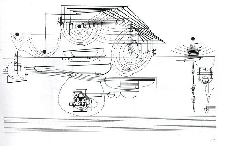
Inspired by Cornelius Cardew, I sketched out my graphic music notations.

Result: Graphic music notation provides freedom for both composers and performers to express themselves. However, graphic music notation does not have enough detail to present the music. This can be a problem when a music band have multiple instruments.
I discussed with my supervisor, I decided to go back to the original idea of redesigning the layout. The supervisor suggested me looking at how music games present the music.
For example, the famous game Magic Piano used a few keys for the players to play music. I also find some developers use Javascript to create a music game. I think the code is not too complicated, which can be a good reference.
Then, I made a simple prototype of the music game.


Result: Music games mainly use the piano to present the music. Instruments like flute have a complicated finger chart. Therefore, the position of the finger can not be shown the same way as the piano. This also implies the visualisation of music games can not be alternative to the traditional music sheets.
Next, I researched music dyslexia. The result gave me some ideas about how I can improve the music sheet. People with music dyslexia might have difficulties in spatial processing. Therefore, some of them prefer to read the number music notation than the traditional music notation. They will also use colour to highlight notes or symbols to strengthen their memories.
I made an online survey on Instagram to ask people:
24 people answered question 1, 10 people answered question 2.
In question 1, 12 people voted for original music notation. 6 people voted for alphabet music nation and 6 people voted for number music notation. This can also be analysed as 12 people prefer the traditional way, 12 people prefer the modified way.

In question 2, 10 people from question 1 gave more detailed answers about their choices. I listed out the 3 most interesting answers.

Then, I did some user interviews to ask more questions about users’ music experience. The personas are based on the interviews.


From the personas, we can see the goals from users are:
After understanding the main goals what the users trying to achieve, I redesign the music and prototyped my idea. I aimed to make music sheets easier to read, so I make the layout focusing on the current bars the users are playing. Also, the speed of the animation is the tempo of the music.
I tested the prototype with 5 people. 3 people are from the music bands I joined, they play the flute.

In the tests, I gave them two versions of the music sheet. One is a still image with the original layout, the other is an animation of the modified music sheet. They are both the same music piece. To avoid bias from me, I did blind tests. I asked the users to play both versions in random order. I could not tell which version they were playing at that time.


After the tests, I analysed the advantages and disadvantages of their feedback.

The feedback from the users is very helpful for the research.
Next, I made the user journey for the product.

User flow provides me better understanding of users' need. Next, I sketched out the design.

I designed the interface in Figma and prototype it. Then, I coded it with Javascript to make it an interactive website.


Museay is an online platform that makes music sheets easier to read. In the app, the platform includes a music library for users to download digital music sheets.Users can also upload their sheets. There are two modes for the users to view the music sheets. One is still images with the traditional layout of the music notation, the other is a modified layout. In the modified layout, the music sheet will be separated by bars, and users can focus on the current playing bar. Users have the option to view the number of the bar they will like to view ahead. Both versions can also be viewed as alphabet music nation or number music notation. Users also can edit the music sheets by drawing or highlighting the notes. The freedom of Museay provides users with a better experience when they practice the music.
During the iterative design process, I did some research on music dyslexia. However, I could not find users with music dyslexia to do user interviews. It will be more helpful if I can get some feedback from them. Including more features for people with music dyslexia can make the product more accessible.
I also tested the final outcome with 5 people. Some users suggested that I add more colours for drawing ,make the animation for the opacity faster and add some contrast for icons. However ,users are satisfied with the project outcome and are willing to use the product.Generally speaking, I learned a lot from the researches and user tests. Feedbacks from users improves my designs.